|
This is a brief tutorial of a typical workflow in Photoshop for the pictures I do.
You may use this in your own work, or use it to learn what I am doing to the photos you purchase.
Not every shot goes through every step. Some go through more, some skip steps because they don't need them.
One thing I am leaving out is the RAW converter.
I always shoot in raw but seldom use the RAW converter to do anything with the image.
Occasionally the image is over exposed and I will use the RAW converter to correct this.
In looking over this you will notice that not much happens in any one step but that the overall result shows a clear improvement.
Some images have more initial problems than this one and show a larger improvement from an single step.
I just picked this one more or less at random. If you have any questions, drop me a note.
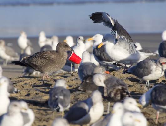
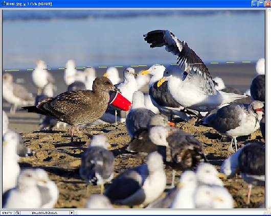
Above is the starting image out of the RAW converter.
It is a humorous image of a young seagull showing off its wonderful find to its parent (that is my story and I am sticking with it).
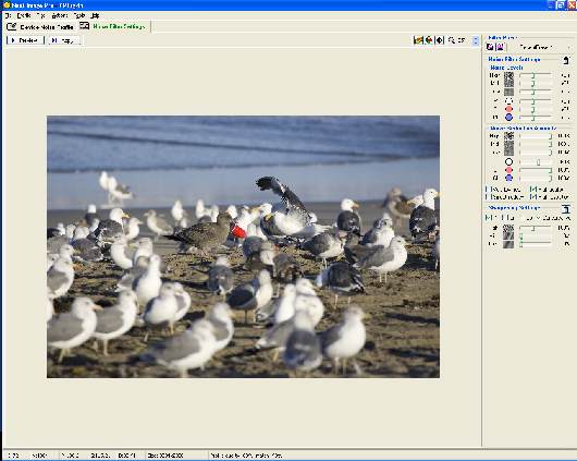
The first thing I do is use a product called NeatImage to reduce the noise and sharpen the detail.
Sharpening should be done at the transitions where digitizing and interpolation take place.
This means right after the transfer from the camera and right before the transfer to the printer.
The amount of sharpening in this first step depends on the sharpness of the lens.
I use different amounts of sharpening for different lenses.
I also use a custom reference target for NeatImage so that I am actually referencing my camera body and not some typical setup.
It is important to have the reference target match the workflow up to this point so if I did any corrections in the RAW filter,
I need to make sure my reference target went through the same flow.
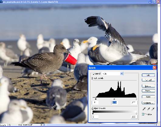
The first operation in Photo Shop after Neat Image is to use the Levels adjustment layer to set the dark point, light point, and overall brightness.
Basically, this means to set the three sliders on the levels histogram.
In above case, the histogram looks for the white point and the image doesn't look like it has a color cast so we will leave that one alone.
The dark point is too light so we will move the slider up to 17.
A point to remember is that we are dealing with a professional camera here.
It is designed to capture as much information as possible, not produce the best pictures right out of the camera.
What this means is that typically the images out of the camera are low contrast and without Photoshop or the equivalent, they look dull.
The benefit is that the final result after they are adjusted can have greater detail in highlights and shadow than it would otherwise have.
In this example, I also increased the brightness. You may notice that this decreases the contrast. We won't worry about that because the next step corrects that.
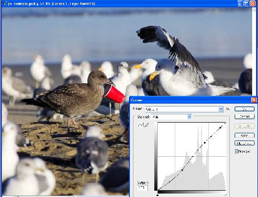
The Curves step restores contrast that is either reduced by the levels step, or just not in the image to begin with.
There are two guiding principals here.
First is to increase the overall contrast by making the bright part of the image brighter and the dim part of the image dimmer yet leaving the overall brightness the same.
nailing the center point at the center is the basic strategy for keeping the overall brightness the same.
The second goal is to selectively increase the contrast of parts of the image.
Contrast is increased when the slope of the curve is increased.
If you move the cursor over parts of the image you want to have more contrast and see where these levels are on the curve,
you can make those areas steeper on the curve and thus add contrast to just those parts of the image.
In the case of this image, I wanted to not add contrast to the bright white gulls so decreased the slope of the curve at the high end relative to what I would normally do.
The next step is to add some saturation to the image.
Remember, with a professional camera, the image out of the camera doesn't have the kind of saturation addition that you would have with a consumer camera.
It has to be added in Photoshop. Often it doesn't take much. In this In this case, I added +10 to the overall image.
I thought of adding a little to the red but think it is high enough. I added +5 to the blue.
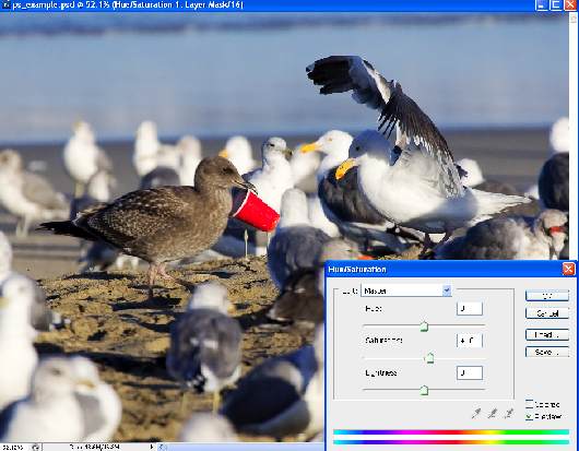
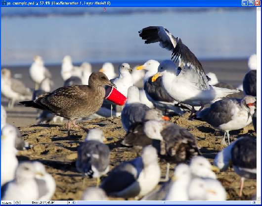
You can just see it in the previous image above the dialog box.
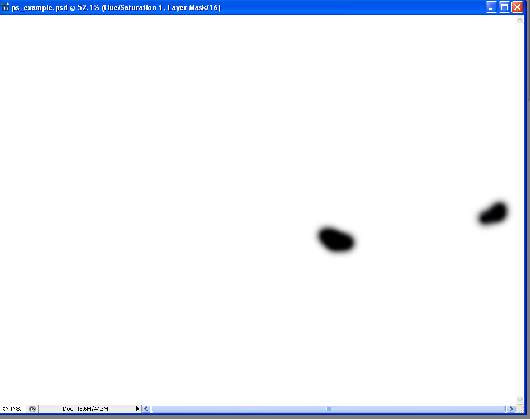
The amount of red in some of the gulls beaks is distracting.
I took the brush tool and blacked out the layer mask over the beaks on the H&S layer. This reduced the saturation on these elements.
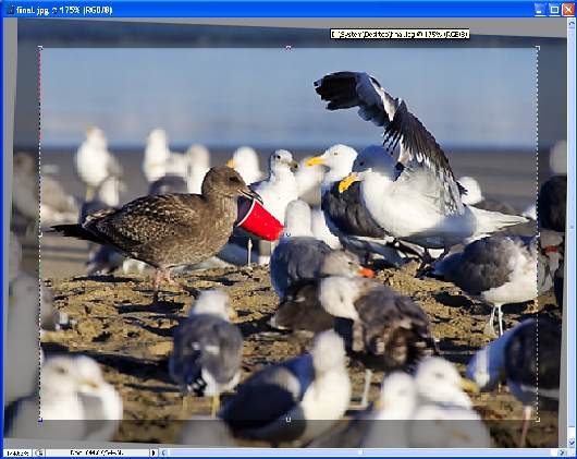
The image is done at this point except that it needs to go somewhere.
Before it goes there, or while it goes there, it needs final sharpening.
Normally,I would use QIMAGE to do the interpolation and sharpening for the printer.
In this case, as I am obviously outputting this image to a computer screen, I will do the equivalent sharpening in Photoshop.
First I resize for the final display. In this case I also change from 16 bit to 8 bit images and from Adobe RGB to sRGB.
After the image is resized, I apply an unsharp mask that I have determined is close to equivalent to what QIMAGE would do.
The settings are 100%, .7 pixels, and 2 or 3 as the threshold. An equivalent setting would be 70% and 1 pixel if your program will not allow fractional pixels.
At this point I notice that the horizon is not straight.
I probably should have corrected that early but it doesn't really matter because I have not done my final crop.
I take a ruler tool and align it with the beach line. Then I apply a rotation of just the measured amount to straighten the image.
I usually crop when printing. Different prints have different aspect ratios so obviously require different crops.
I like to get an aesthetic crop that matches the aspect ratio I need.
If this isn't possible, I will go with the aesthetic crop and cut the mat to match giving an offset or weighted mat.
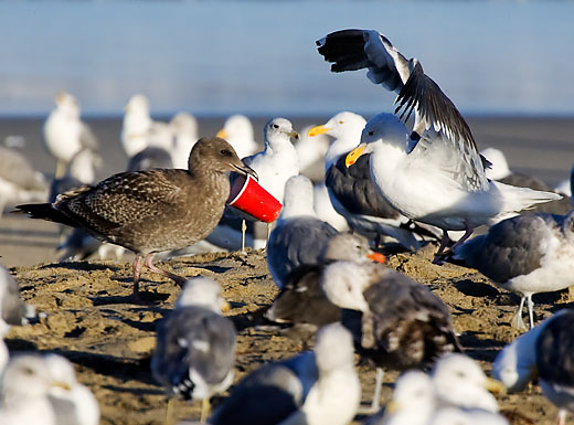
In this case when the output is going to a computer screen, I can crop just for the best aesthetic presentation.
I try and crop out distracting elements and focus the viewer on the subject as much as possible.
Before:
After:
|